I really like the game you should get back to it and add the missing features such as the menu and a flesh out combat system and from there you have a nice and fun game :) Here's the main problem right now, you make it so that the ai sort of mirrors the progression of the player and this is fine but right now is completly out of balance I had 8 warriors, and the ai seems to have like 40 of them :( , other than that really great concept :)
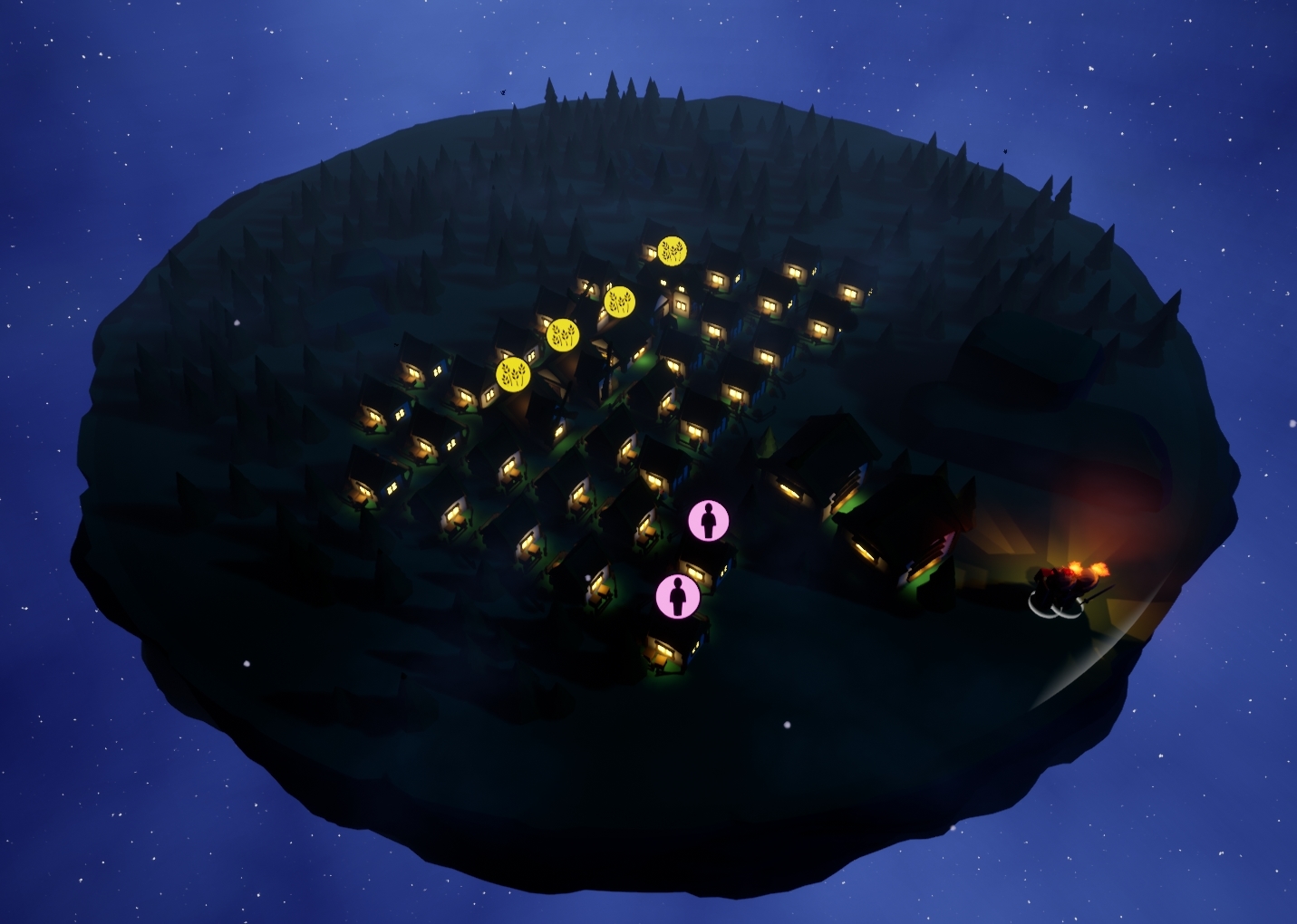
This is actually pretty technically impressive, what with having nav on both sides of the disk, and I didn't find any bugs while I was playing. It's visually cohesive and appealing. It gets a little hard to see at night; it might be worth giving each building its own little torch just to help with night vision. From a UX approach I'd like to see a list of controls on-screen somewhere.
Thank you! The two sided navigation took a lot of time. Unfortunately, even if you didn't find them, there are certainly some bugs haha.
Lights during the night were on the list of tasks that weren't completed during the jam unfortunately. After the judging period is finished and I can upload a patch I will do so with that feature. (and many bug fixes etc.)
Here's a preview:
Controls, a main menu, pausing, etc. are all desirable features that were not prioritized in the jam over core game play which was being implemented up until submission. Alas!
Hello there! I really like the graphics and the difference between the two sides! keep it up! Have you considered participating in our GDWC #gamedev contest? Check out our itch.io page for more infos ;)
← Return to game
Comments
Log in with itch.io to leave a comment.
I really like the game you should get back to it and add the missing features such as the menu and a flesh out combat system and from there you have a nice and fun game :)

Here's the main problem right now, you make it so that the ai sort of mirrors the progression of the player and this is fine but right now is completly out of balance I had 8 warriors, and the ai seems to have like 40 of them :( , other than that really great concept :)
This is actually pretty technically impressive, what with having nav on both sides of the disk, and I didn't find any bugs while I was playing.
It's visually cohesive and appealing. It gets a little hard to see at night; it might be worth giving each building its own little torch just to help with night vision.
From a UX approach I'd like to see a list of controls on-screen somewhere.
Thank you! The two sided navigation took a lot of time. Unfortunately, even if you didn't find them, there are certainly some bugs haha.
Lights during the night were on the list of tasks that weren't completed during the jam unfortunately. After the judging period is finished and I can upload a patch I will do so with that feature. (and many bug fixes etc.)
Here's a preview:

Controls, a main menu, pausing, etc. are all desirable features that were not prioritized in the jam over core game play which was being implemented up until submission. Alas!
Thanks for playing!
Hello there! I really like the graphics and the difference between the two sides! keep it up! Have you considered participating in our GDWC #gamedev contest? Check out our itch.io page for more infos ;)
Thank you!
Game is simple and fun, love seeing my little guys jump off the side
Thanks! Glad you liked it!